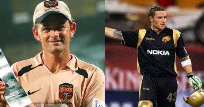
For any team-based sport, the kit plays an important role in showcasing the brand of the squad. While when it comes to nations, teams usually have a fixed colour, but for franchises or clubs, a lot of experiments can be done with the kits. In this article, we rank the best jerseys of franchises in IPL 2008.
When IPL started, it was probably for the first time that fans were witnessing their favourite stars in a colour that was different from the country’s kit colour. Hence, there was a lot of excitement. Therefore, there were a lot of scrutinies, too.
8) Kings XI Punjab
Kings XI Punjab IPL 2008 ❤️ pic.twitter.com/kqx6bs9zE2
— Epic Cricket Comments (@CricketEpic) March 14, 2022
When it comes to the jerseys of franchises in IPL 2008, we have Kings XI Punjab at the bottom of the list. The colour combination they opted for did not exactly look great. The contrast was less attractive and the pattern on the jersey was also not impressive. While they did improve on it as the competition progressed, it needs to be seen if they will change it for IPL 2022.
7) Mumbai Indians
➡️ #MITales 📖 | 2008, Mumbai. The City of Dreams finally had a global team of its own. Led by Mumbai boy and India’s favourite son, Sachin Tendulkar, Mumbai now had an IPL team named Mumbai Indians.#OneFamily @sachin_rt @Sanath07 pic.twitter.com/cETNRYwsr9
— Mumbai Indians (@mipaltan) May 8, 2020
Mumbai Indians is the most successful franchise in the history of the league. However, they did not do a great job with their kit in IPL 2008. The colour combination of light and dark blue did not have an impact on the visibility. The pattern of colour distribution was also not that creative.
6) Royal Challengers Bangalore
A trip down memory lane. Here’s a thread on the evolution of @RCBTweets jerseys.
— Sai Krishna (@imSkrishnaaa) March 30, 2021
DLF IPL 2008
Jersey/ Kit Manufacturer: Reebok
The time when everything just began. The OG jersey!#PlayBold #IPL2021 #RCBJersey pic.twitter.com/puYB4FBess
RCB picked the colour combination of red and yellow, signifying the colours from the state flag of Karnataka. While that was good, the pattern of the colour mix was not exactly fascinating. However, they have one of the best kits at the moment.
5) Chennai Super Kings
Thala / Thalapathy Combo pic from CSK Jersey Launch in 2008. Want to see them together again ?
— Whistle Podu Army ® – CSK Fan Club (@CSKFansOfficial) March 2, 2018
THALAPATHY62 DIWALI ONCARDS pic.twitter.com/AdIkSLQord
CSK pulled off a decent job when it came to jerseys of franchises in IPL 2008. However, a few felt that the kit was too plain. They, later on, improved it with more blue and a brighter yellow hue.
4) Rajasthan Royals
52 (29) 🔥
— Rajasthan Royals (@rajasthanroyals) May 30, 2021
Gambhir. Sehwag. Dhawan ☝️#OnThisDay in 2008, a @ShaneRWatson33 special in @IPL’s first-ever semi-final. 👏#HallaBol | #RoyalsFamily pic.twitter.com/RQJULFCTQj
The winners of IPL 2008, Rajasthan Royals took a safe route regarding their jersey for the initial season. They opted for a dark blue shade, which looked good on screen. The franchise did not try to become too creative and that could have worked in their favour.
3) Deccan Chargers
Deccan Chargers picked a colour that not many teams usually choose. Hence, the jersey felt fresh. The contrast of colours was also well presented. However, they changed it in the next season itself.
2) Delhi Daredevils
The KKR Black-and-Gold was definitely quite brilliant, but nothing ever comes close to this beauty…Delhi Daredevils 2008 IPL season & Glenn McGrath slicing up batting lineups for fun while being decked in black-and-red… https://t.co/mhBesj1PZb pic.twitter.com/mFKxEPf6sz
— Abhinav (@abhinav_k316) January 24, 2022
The black-and-red combination did well for DD in the initial seasons. They also went for a straightforward pattern and it felt really pleasing to the eye. Hence, they stand at No.2 on this list.
1) Kolkata Knight Riders
With Shahrukh Khan as the owner, KKR was bound to ooze creativity and class. Firstly, they had a cool name to the franchise, something that others could not manage. Next up, they had a solid logo and backed it up with the extremely impressive black-and-gold colour combination. However, they later changed it to purple-and-gold and since then, the jerseys have been lacklustre.


